Maybe, Just Maybe, a Faint Glimmer of Hope for Labor Demand?!?!
Maybe, just maybe, the worst is over for the first massive wave of decimation to the U.S. labor market and that labor demand is no longer in a free-fall.

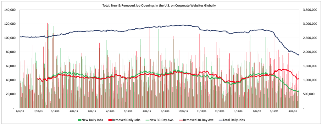
We’ll be publishing a ton of graphs and charts next week in conjunction with our non-farm payroll forecast for April, but one of the charts we are looking at closely these days for any hint of a positive signal is the daily number of new, removed, and total job openings in the U.S. The chart below depicts those daily metrics since January 2018 as well as a 30-day rolling average for new and removed job openings.
Note: LinkUp’s job market data consists of job openings sourced directly and exclusively from company websites around the world. The data is updated daily from roughly 60,000 corporate websites globally so there are no expired jobs, no duplicate listings, and no job board pollution. Because the best indicator of a job being added to the economy somewhere in the future is a job opening that an employer posts on its own corporate website, our data delivers deep insights into labor demand across the entire economy and is highly predictive of job growth (or declines) in future periods. As well, jobs are typically removed from company websites for two reasons – either because the opening was filled with a new hire or because the company no longer intends to fill that position and is no longer accepting applicants. It’s not always perfectly clear which is the case for a given company at a given point in time, but context and statistical analysis allow for pretty safe assumptions, and the current set of circumstances absolutely fall into that category and are largely the result of the latter.

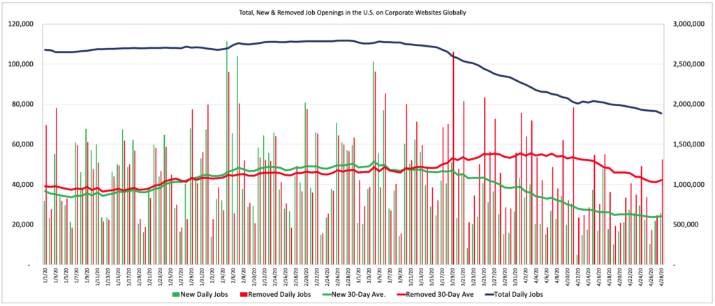
Looking at the same data since January 1st of this year provides a glimmer of hope that maybe, just maybe, the worst is over for the first massive wave of decimation to the U.S. labor market and that labor demand is no longer in a free-fall. The data points providing that hope, as miniscule as it might be, include the 30-day rolling average of Removed Daily Jobs which has been declining for the past 3 weeks and the 30-day rolling average for New Daily Jobs which has not dropped in a week.

For certain, it would be absurd to get too excited about such data at this point in time, and there is an endless supply of reasons to maintain a crazy-high level of pessimism and skepticism, especially given the fact that we are just beginning to see the next wave of layoff announcements and the related ripple effects, but at least there’s a possibility that the worst of the first wave of obliteration is over for the job market.
If that is the case then maybe, just maybe, we can begin moving to the next phase (whatever that looks like) of this horrific situation, taking away some small sense of positivity from the fact that we could be one step closer (of how many, who knows) towards some form of recovery.
We’ll provide additional detail next week along with our forecast for April’s non-farm payrolls.
For anyone interested in the data behind these charts or the other analytics files in our macro/COVID-19 data package, please contact us here.
Insights: Related insights and resources
-
Blog
01.07.2021
LinkUp Forecasting Net Gain Of Just 50,000 Jobs In December
Read full article -
Blog
11.05.2020
LinkUp Forecasting Net Gain of Just 350,000 Jobs In October
Read full article -
Blog
04.14.2020
Job Openings From Company and Employer Websites Are Down 28% since The Beginning of March
Read full article
Stay Informed: Get monthly job market insights delivered right to your inbox.
Thank you for your message!
The LinkUp team will be in touch shortly.
